We’ve added a few new reports and graphs for campaign level reporting to help visualize the success of your giveaways. You can now view unique entrants by geographic location, date entered or total, unique entrants over the length of the campaign. These graphs are designed to allow you to absorb information and trends related to your sweepstakes in seconds.
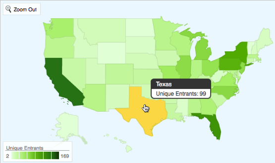
Unique entrants by geographic location
The location based information is based upon the IP address which the was recorded for the entrant when they visited the sweepstakes entry form. This is translated to match a geographic region and is plotted on the map. You are able to drill down to the state level for this map or view the entire world by country.
Although data about country location is accurate, and state level data is usually pretty accurate, detailed local data can sometimes be inaccurate due to how ISPs handle IP addresses. If the region for an IP address is unable to be identified, that entrant is not represented in the map.
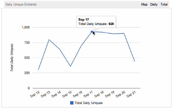
Unique entrants by date
The daily view of unique entrants for your giveaway shows how many individual entrants successfully entered the campaign on that date. This is an easy, visual way to see the impact of marketing campaigns in seconds. This graph should help relate an influx of entrants back to a source such as a Tweet or inclusion in your email newsletter.
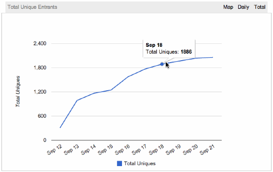
Total unique entrants to-date
The total unique entrants report is a clear way to easily see the volume of entries into the sweepstakes over the time period that the campaign is live. Drastic increases are likely abel to related back to marketing efforts. A steady horizontal line shows that the campaign is not attracting new entrants during that period. Unlike the daily report, this graph will only count an entrant a single time — this means that if you have Daily entry options you may be receiving additional entries when the line looks flat, but are not attracting new, unique entrants.

0 Comments